© 2026 Inowa Digital - All rights reserved.

Moka did not need to look bigger than it is. It needed its digital presence to finally reflect the scale it had already reached. For a company with more than three decades of experience, a broad product portfolio and substantial production capabilities, we created one system connecting its website, content, social media and packaging.
Services: Creative direction · Web design and development · Photography and video · Social media · Packaging design · Ongoing support
Moka produces frozen dough, pastries, pies, strudels and other products supplied to customers and partners across Europe. Behind the brand are serious production capabilities, a broad portfolio and more than 30 years of experience. Yet its previous digital presence did not communicate the scale of the company or the quality of what came out of its production.
Our task was therefore bigger than designing a better-looking website. We needed to build a visual language capable of presenting both a product that should feel immediately appetising and an operation that major distributors can trust.
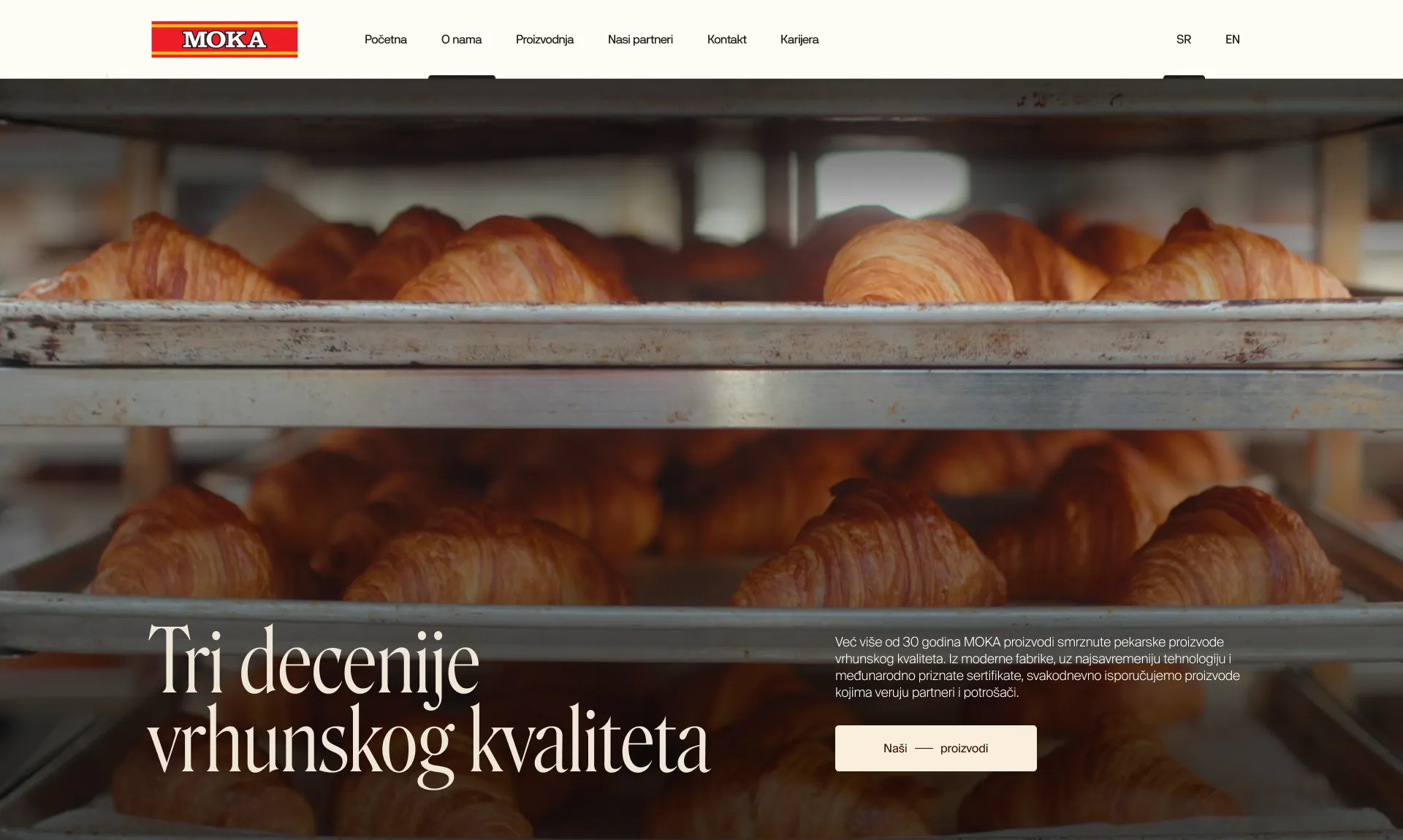
The central question was simple: how do you present large-scale production, dozens of products and a serious B2B operation while keeping the warmth associated with food?
We started with a contrast already present within Moka - industrial precision in the background, product in the foreground. The website therefore feels neither like a factory catalogue nor a generic food template. Large typography carries the confidence of the company, photography gives the products the leading role, and warm colours with generous space keep everything fresh and approachable.
We did not want every category to feel identical. Pies, pastries, dumplings and the Bake Off range each received their own rhythm, compositions and visual accents, while a shared grid, type system and motion language keep them unmistakably part of the same Moka world.
A broad portfolio can quickly become an endless product list. We built the site architecture around clear product groups and the different reasons people visit the website.
Customers can quickly reach the products they are interested in. Potential partners can understand Moka's capabilities, markets and approach to cooperation. Candidates can learn about the company and open roles. Separate business areas, including logistics, cold storage and ice production, have enough room to be presented as substantial parts of the operation rather than footnotes to the main business.
The result is a website that does not try to say everything at once. It gives each visitor the information they came to find.
The visual direction would not have worked with stock material. Photography and video were planned alongside the website structure, so every shot had a defined role - from close product details that create appetite to production footage that reveals the scale and standards behind the brand.
We combined product photography with process details, people and facilities. Visitors see not only what Moka sells, but what it takes to produce it and deliver it across more than 18 markets.
We carried the principles established on the website into Instagram, without simply shrinking them into post-sized layouts. We developed a flexible system for product stories, Reels, production footage, company news, trade fairs, recruitment and partner communication.
The product remains the main character, while typography, colour, framing and editing pace make the content recognisably Moka before the logo is even read. The feed no longer feels like a sequence of unrelated posts, but an active channel belonging to the same company presented on the website.
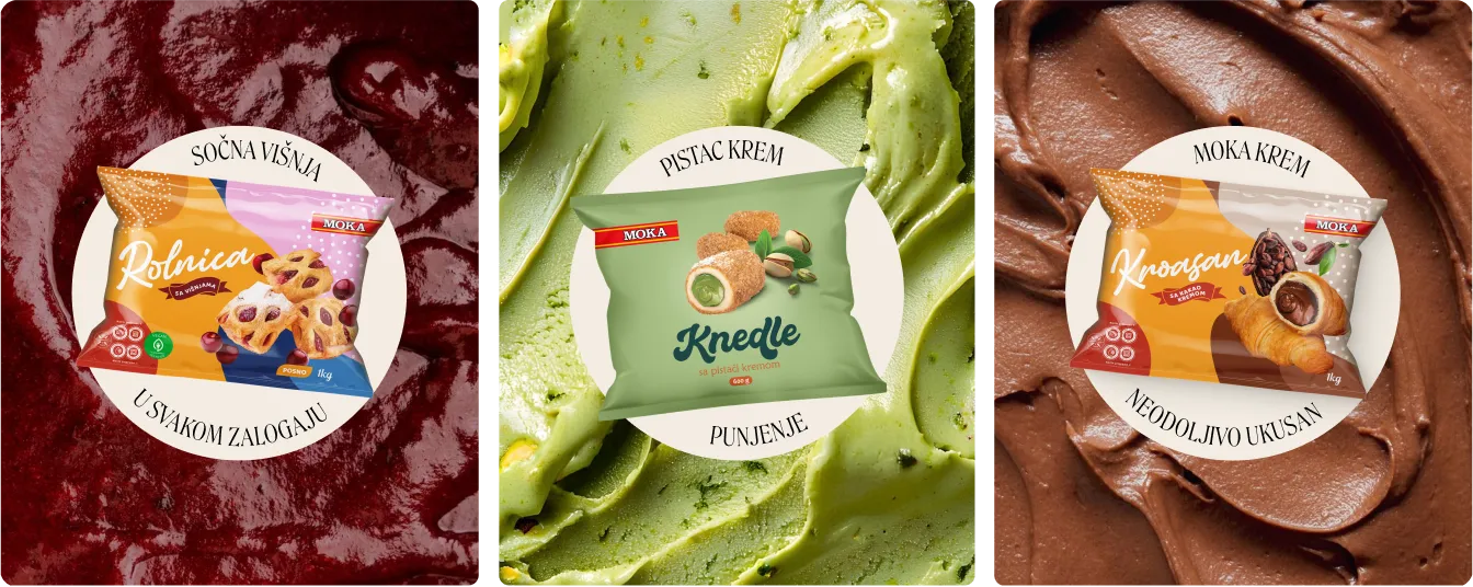
As the partnership developed, the same thinking moved into physical products. Packaging had to be clear at the point of sale, practical in use and distinctive enough to remain recognisably Moka - even when created for a separate range such as Arctica ice.
Instead of solving every new format in isolation, we built principles that could expand with the offer. The website, social media, photography and packaging began to speak the same visual language.
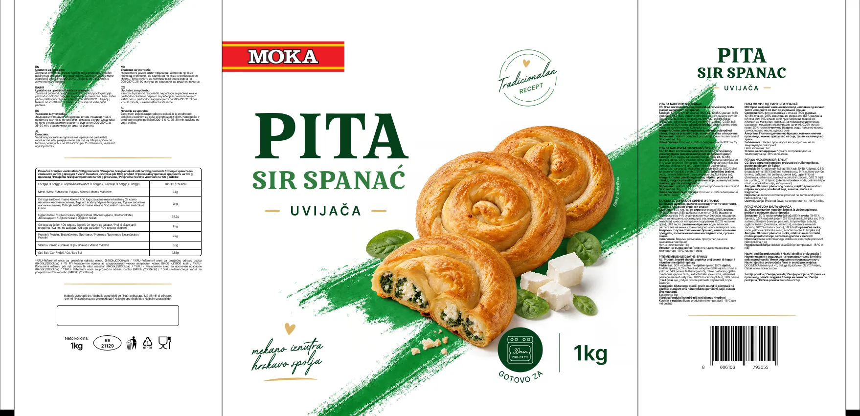
The collaboration began with a website, but it did not end at launch. The understanding of Moka's business developed during the project allowed us to take on a broader role - from ongoing content and campaigns to new packaging and the digital needs that emerge throughout the year.
Today, we do not treat Moka as a collection of separate tasks. We work as an extension of its team, with one shared objective: to make the way the company presents itself reflect the quality, growth and operational scale that already exist behind the brand.
Moka gained more than a new website. It gained a clearer way to present its products, production capabilities and company scale across every digital and physical touchpoint.
For us, the strongest outcome is that a single website project grew into a long-term Creative Partner relationship - the clearest proof that the system works not only visually, but in the brand's everyday communication.



We combine strategy with high-end design.
©2026 Inowa Digital
Our SaaS